This topic studies how two numerical variables may be related. We look at correlation to measure the
strength and direction of a linear relationship and use a regression line to make predictions.
A key idea is that correlation does not imply causation: even a strong correlation does not automatically
mean that one variable causes the other.
1. Linear correlation and Pearson’s product–moment coefficient
Linear correlation of bivariate data
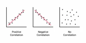
When each individual in a data set provides a pair of values (x, y), we call the data bivariate.
We are interested in whether increases in x tend to be associated with increases or decreases in y.
- Positive correlation: as x increases, y tends to increase.
- Negative correlation: as x increases, y tends to decrease.
- No (or very weak) correlation: there is no clear linear pattern.
1,920 × 972
Pearson’s product–moment correlation coefficient, r
Pearson’s coefficient r is a number between −1 and 1 that measures the strength and
direction of the linear relationship between x and y.
- r ≈ 1 → strong positive linear correlation.
- r ≈ −1 → strong negative linear correlation.
- r ≈ 0 → little or no linear correlation.
Technology (GDC) is normally used to calculate r in IB exams. Hand calculations are not required but can help
you understand that r combines information from means, standard deviations and the “matching” of x and y values.
🌍 Real-World Connection:
Correlation is widely used in economics (e.g. income vs. spending), health science
(exercise vs. blood pressure), and environmental studies (CO₂ levels vs. temperature).
Analysts often start by computing r to see whether a straight-line model might be reasonable.
2. Scatter diagrams and lines of best fit
Scatter diagrams
A scatter diagram is a plot of the paired data (x, y) on a coordinate grid. By eye, we look for:
- Overall direction (positive, negative or none).
- Approximate linearity (do the points lie roughly along a straight line?).
- Presence of outliers that do not follow the main pattern.
Line of best fit (by eye)
A straight line can be sketched to represent the overall trend. When doing this by eye:
- The line should pass roughly through the mean point (average x, average y).
- The points should be scattered fairly evenly above and below the line.
🧠 Examiner Tip:
When asked to comment on a scatter diagram, use clear language such as
“strong positive linear correlation”
or “weak negative correlation”.
Avoid vague phrases like “they are sort of related”.
3. Regression line of y on x
Equation of the regression line
When the relationship between x and y is roughly linear, we model it with an equation of the form
y = a x + b.
This is called the regression line of y on x. Technology is used to find the values of a (slope) and b (intercept) by
minimising the total squared vertical distances between the observed points and the line.
Meaning of the parameters a and b
a (slope): the predicted change in y when x increases by 1 unit.
For example, if a = 0.5, then increasing x by 1 increases the predicted y by 0.5 on average.
b (y-intercept): the predicted value of y when x = 0. This may or may not be meaningful, depending on the context.
🟢 GDC Tip:
Enter x-values into one list and y-values into another (for example L1 and L2).
Use your calculator’s LinReg or regression function to obtain a, b and r.
Many GDCs also allow you to draw the regression line on the scatter plot to visually check the fit.
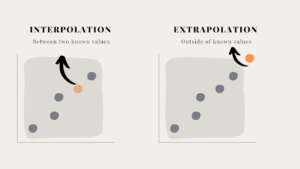
4. Using the regression line for prediction
Once we have a regression equation, we can use it to predict y from x.
This is useful when we know x-values that were not directly measured.
- Interpolation: predicting for x-values within the observed data range.
Usually reliable if the relationship is clearly linear. - Extrapolation: predicting for x-values outside the observed range.
This is dangerous because the true relationship may change beyond the data.
https://builtin.com/sites/www.builtin.com/files/styles/ckeditor_optimize/public/inline-images/
🌍 Real-World Connection:
Regression is used to forecast sales from advertising spend,
exam scores from study hours, or house prices from size.
In each case, predictions far outside the original data range can be very misleading because conditions may no longer be similar.
🧠 Examiner Tip:
If a question explicitly mentions values outside the data range,
you should comment on the danger of extrapolation.
Full marks often require a short sentence explaining that the model may no longer hold.